Conclusion
The map below represents the geographical distribution of all 435 congressional districts of the 116th United States Congress, according to the last modifications of 2018 Remedial Congressional District
The intensity of the color indicates the prediction confidence.
The red color of a district refers to a predicted victory for Republicans, while the blue color refers to a predicted victory for Democrats.
Forecasting the race for the House
The intensity of the color indicate the prediction confidence
Our forecast for every district
The chance of each candidate winning in all 435 House districts
Predictions score
Our final predictions for 2018 data reached an accuracy of 89.89%.
On a total of 435 districts, we predicted correctly 391 and mispredicted 44.
Comparing predictions with actual results:
| Predictions | Actual results | Before elections | |
|---|---|---|---|
| N. Democrat districts | 190 | 230 | 194 |
| N. Republican districts | 245 | 205 | 241 |
The plot below shows 435 round markers, one per each congressional district: the position of the markers through the horizontal axis, as well as the color intensity, relates to our prediction probability. It goes from left for 100% probability Democrat, to right for 100% probability Republican, with less certain predictions in the middle. The more districts within the same probability interval, the higher the pile. The blue or red color of the marker refers to the actual result of the elections: red for a victory of Republicans, blue for Democrats.
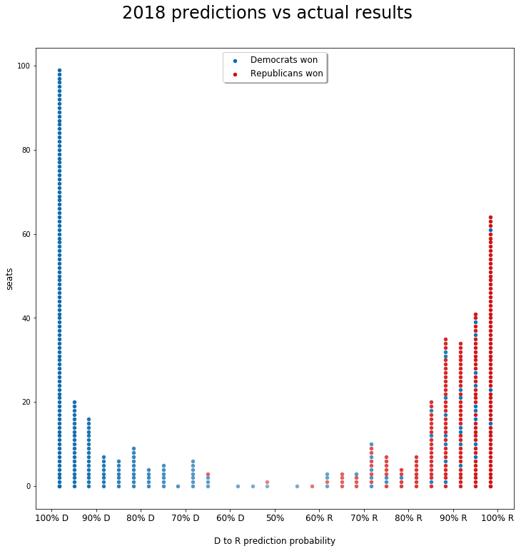
We notice how only two of those mispredictions are actually republicans when we predicted democrats, although the probability for those two is below 70%. On the other hand, 42 of those 44 mispredictions went from democrats (actual result) to republicans (prediction), this means that our model is slightly in favor of republicans. If we include the situation before elections and we look at the feature importance we notice how it has a tendency to confirm candidates which are running for re-election.
Features
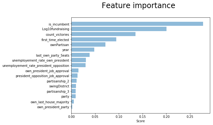
As we would expect, some of the electorate behaviors are seen in the data. The incumbent candidates have a great advantage compared to the opponents.
The fact that our simple baseline model has an accuracy of 76.8% tells a lot about partisanship: several districts stick with the same party for long time.
Some of the interaction terms and engineered features got high scores in the models. For example the Log10fundraising and ownPartisan.
On the other hand, it was surprising to see how some features which we would expect having great importance, were getting a low or not so high score in the models. For example the party of the president and the seats ratio of the candidate’s party in the House of representative.
In fact, during midterm elections the president usually loses seats in the House of Representative. Deriving a feature with the actual representative’s party in each district could have improved to highlight this behavior also in our model.
The data quality and collinearity of some features have certainly a big impact over those ones.
After having ran several different configurations, we saw how dropping some collinear features like first_time_elected or count_victories could bring to a more neutral model, but reduced the cross-validation scores overall.
Choosing the training data
We also noticed how selecting the training data influenced the model performances. Taking only midterm years as training set was improving the score of our boosting model against the others, while including also the presidential years was giving random forests as best, with also better stacking. So we decided to keep both presidential and midterm years in the training set, though keeping the validation folds as only midterms.
Future improvements
District redistribution
District redistribution reduces data quality dramatically. All districts coming after a redistribution have no historical data per se, prior the redistribution. We would propose to collect the data from the districts preceding the redistribution and apply them to create a state model. Using the state model and the others district data at every year we could impute the historical data for those districts.
Improvement by changing the modeling sequence
In our process to producing final predictions, we went through several optimization phases.
In each phase we improved the current model, before passing to the next.
Specifically, we refer to:
- Compute cross-validation accuracy
- Improvement 1: mutual exclusive winning candidate per district
- Improvement 2: compute accuracy by district, instead than by candidate, including districts without predictions
- Stacking models predictions
We could potentially improve the score by changing this sequence and placing the stacking before the improvements 1 and 2.
In fact, during improvement 1, when taking the candidate with the highest winning probability in each district, it happens to have exact the same probability between two candidates of opposite parties, so we can’t conclude which one is our winner and we set both to not-winning.
After stacking, the winning probability of each candidate is the weighted average of winning probability from each model prediction, using the stacking linear model coefficients as weight.
It would be, then, much less likely to have two candidates with the same winning probability after stacking. Therefore, the mutual exclusive selection would perform much more efficiently after stacking, instead than before. Due to lack of time within project deadline, we leave this test for further developments.
Outliers years
During EDA we didn’t analyze the data through the different years. This could be a way to drop some special conditions years which otherwise could mislead the predictions.